Enterprise Portfolio Dashboard
user research / sketching / Information Architecture / data visualization
Overview
Trying to create and read portfolio reports for 20 projects with multiple pages each is a tedious task to say the least. My role as a Data Visualization intern was to create an interactive Tableau dashboard that would consolidate the existing Enterprise Portfolio reports into one consumable file.
By bringing a user-centered design process into this project, I created an Enterprise Portfolio Dashboard in Tableau that helped communicate information to key stakeholders with transparency and ease-of use.
The Challenge
As a Data Visualization Intern at Cambia Health Solutions, I was part of the Project Reporting Office (PRO) which tracked and managed over 20 internal-initiative projects. At the time, the team had been manually creating reports for each project using data from over 15 different excel sheets. These reports were then compiled into 10 page documents for Executive presentations.
I was tasked to create an Enterprise Portfolio Dashboard - a visual consolidation of each project's finance, resource, and schedule information into one interactive Tableau file. The end result is a single dashboard with 5 interactive pages, pulling from all 15 data sources. This new dashboard automatically updates as the data sources are refreshed, and can be accessed through a shareable, password protected link within the company.
*To comply with my non-disclosure agreement, I have removed or distorted confidential information in this work piece. All information shared is my own and does not necessarily reflect the views of Cambia Health Solutions.
user research
To understand the purpose of this dashboard, I needed to know the end users, as well as who would be responsible for maintaining and presenting the dashboard. With the help of my mentor, I identified the following stakeholder groups:
- Maintainers: Data analysts on PRO; currently pull together reports from data sheets
- Managers: The 4 PRO managers; send out regular project reports on financials, resource allocation, schedule, and overall status
- Viewers: Executive and VP leaders of the department; primary consumers of the reports coming out of PRO

Maintainers
Maintainers
Responsibilities: scrubbing data sheets, pulling in relevant data as determined by their managers, and creating individual project reports as both Excel sheets and Tableau files. They need to update Tableau files from previous date ranges since they are still used as references.
Goals: provide accurate, up to date data in reports that support the trends managers want to highlight.
"I know which data sets to pull information from each time...it's the same data but just a different date range"
"The time-consuming task is placing new data into a tableau file each time, and having to store tons of old files as reference"
Superpower: Being able to translate concepts like "how is project x's feature velocity impacted by their recent growth in resource allocation in Q3" into data-backed visualizations.

Managers
Managers
Responsibilities: parse through preliminary reports created by the Maintainers and decide what points need to be highlighted and reported on. They send out reports and present the reports to the Viewers and anyone else in the company that has an interest on the portfolio status.
Goals: curate objective reports that still provide reasoning and analysis behind trends and projects' status.
"[we take] an extra step to set up presentations that are devoted to putting in words what the report already shows"
"[my] job is creating a story from data, explaining why a project status is green, even though the feature delivery schedule is way off"
Superpower: Seeing the 'Big Picture' in the eyes of the Viewers and knowing the relevant information to communicate.

Viewers
Viewers
Responsibilities: attend report presentations, read the reports as they come in, and make higher level decisions based off of what they see.
Goals: gain insight from the reports to inform major decisions regarding budgeting and scheduling for projects and departments.
"to really read a report and get where numbers are coming from on [my] own...[I'm] going to be sitting there for a while"
"I'm not sure where reports live...I get them from [managers]"
Superpower: Making informed decision for the benefit of the company
Pain points
After talking with each group, I identified the major pain points in the process from creating the reports to actually having to understand and use them.
Acessibility
The reporting is sent out as Excel and Tableau files. Few people outside of the PRO team are experts at either tool, which means they are dependent on Mangers to walk them through the numbers. Otherwise, they are only gaining a surface level understanding of what was in the reports. Additionally, reports from previous date ranges are stored within the PRO drive, not accessible by the rest of the company.
This proves to be an issue for the Viewers who are responsible for making major decisions based on the reporting numbers. They need to be able to access previous and current reports, and moreover be able to fully understand what is in the reports at all times.
Bloated ReportIng
Each user group faces an issue with the number of items that needed to be bundled into a report. For example, a report on Financials might include an Excel sheet with multiple pages, and 2-3 supporting Tableau files. This is a similar sized package for the portfolio report, project report, and resource report, and more. A Manager may be sending out 4-5 reports, but the Viewer is receiving over 20 documents. This is a lot to read and try to understand, so the Managers send out yet another document - a 10 page summary that they would later present. Maintainers have the tedious job of creating each of those files from a combination of data sources.
The result is repetition of information just shown in different ways, or in other words, bloated reports.
Management of Stored files
With so many data visualizations being created for the reports, maintainers need to ensure that the correct reports and files are being stored as a reference for the future. The Maintainers hesitate to delete old files, but when storage is limited they have to make a decision on which file is potentially the least valuable to keep.
Creating the Dashboard
pages
It is important to note that the users weren't finding the report contents itself difficult to understand, but that the organization of the information and the way it is presented on it's own caused confusion about how different pieces of information was related.
I looked through existing reports and Tableau files to determine an organizational structure to bring some of these views together. By combining the visualizations into one view, Maintainers create and store fewer documents, Managers don't need to explicitly state which file to open for certain information, and Viewers have to parse through less information.
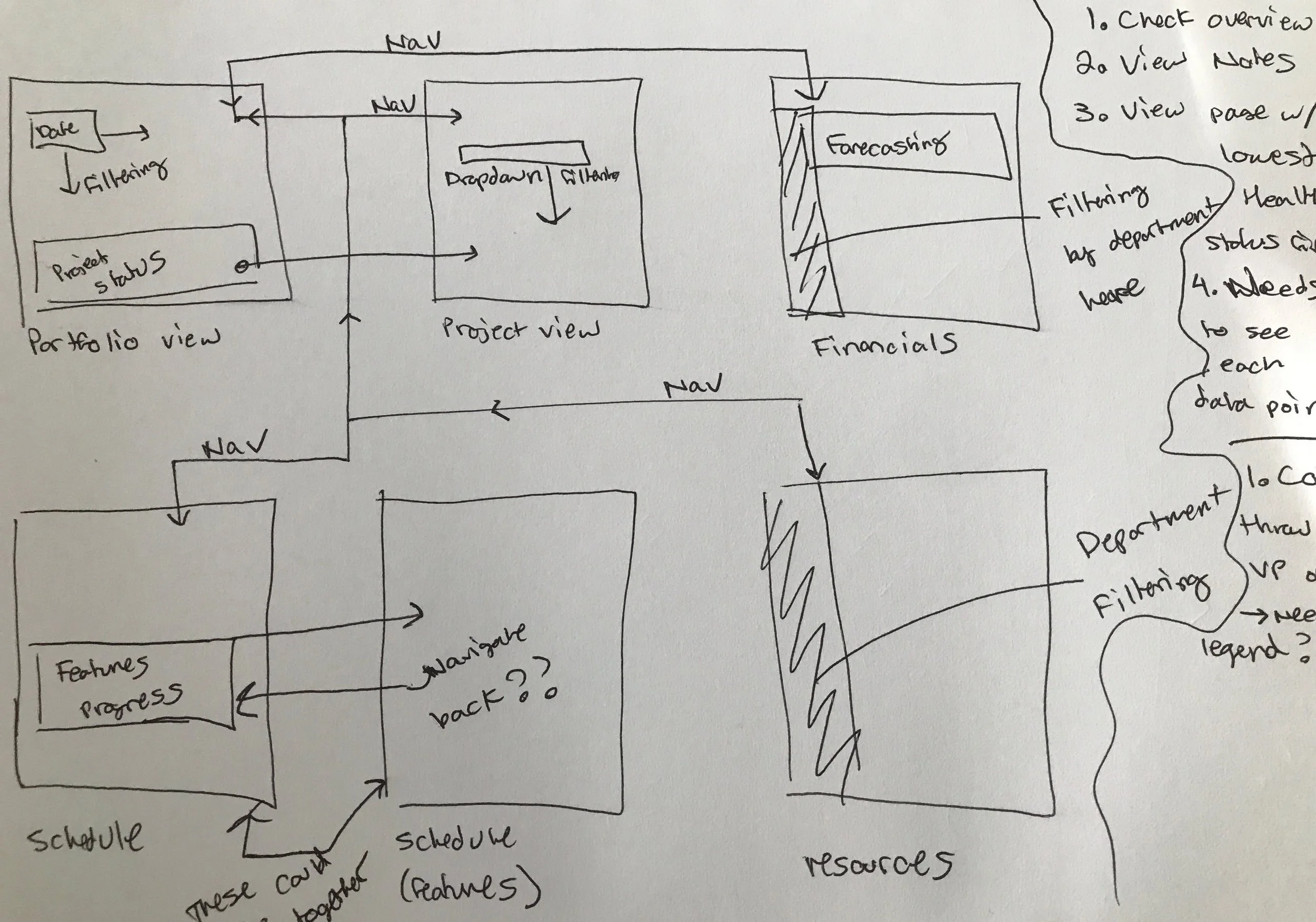
Organizing the various visualizations into groups
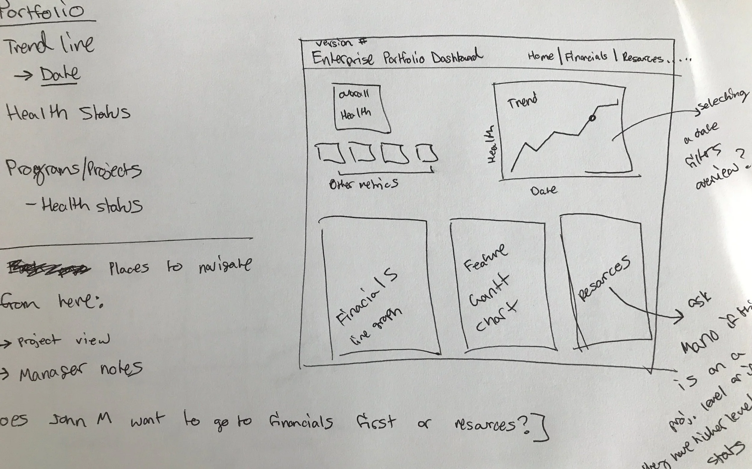
Mapping out the data visualizations on the Portfolio page
Each of the visualization groups function as a different page in the dashboard.
- Portfolio Overview: higher level look at the portfolio health. Defaults at the current date range, but should allow the user to view past data
- Program Overview: a more detailed look at one program/project
- Schedule: feature/delivery cycle information for all projects/programs on the selected date range
- Finance: financial data including forecasting for all projects/programs on the selected date range
- Resource: resource allocation information for all projects/programs on the selected date range
Navigation
Since most of the Viewers would be viewing the Tableau file through a browser, it made sense to match the users' mental model and design the dashboard like a website. Navigation between pages is placed on the top right with icons representing the page contents.
Filtering
Within and between each page is an opportunity to link information together. With tableau, this means that one or more modules could filter other modules. To make all interactions consistent, clicking on a project name would navigate to the detailed project view. Within each page, clicking on a date range would filter all other modules to show data for only that date range, and clicking on a legend item would highlight only that item for all modules. Colors are consistent across pages to better show the relationship between pieces of information.
Storage
Now that the entire report is condensed in one dashboard, the Maintainer reviews the data to make sure everything is working as expected and stores the dashboard in a secure, shared PRO space. The dashboard can be shared via link that is password protected, so Viewers can access the dashboard at any time.
Final designs

Portfolio Overview: High level information on the portfolio status as well as individual project status; ability to select a project to view more information.

Schedule View: Feature delivery schedules can be filtered by project or by feature type.
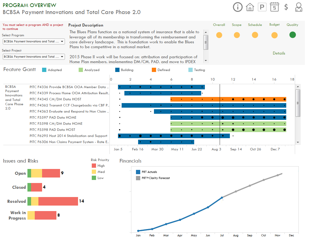
Program/Project View: Snapshot of an individual program/project's status. The user can select the program/project to view using the dropdown in description area.

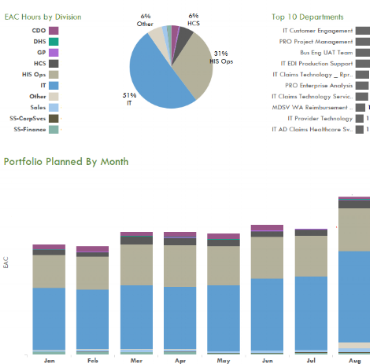
Financial View: Ability to filter by cost center in the top-left chart, or by month and cost center in the timeline graph.